TheBullseye

Insights

The Why. Strategic authority for teams looking for trends, data, industry shifts, and opinion-led perspectives before the market catches up.
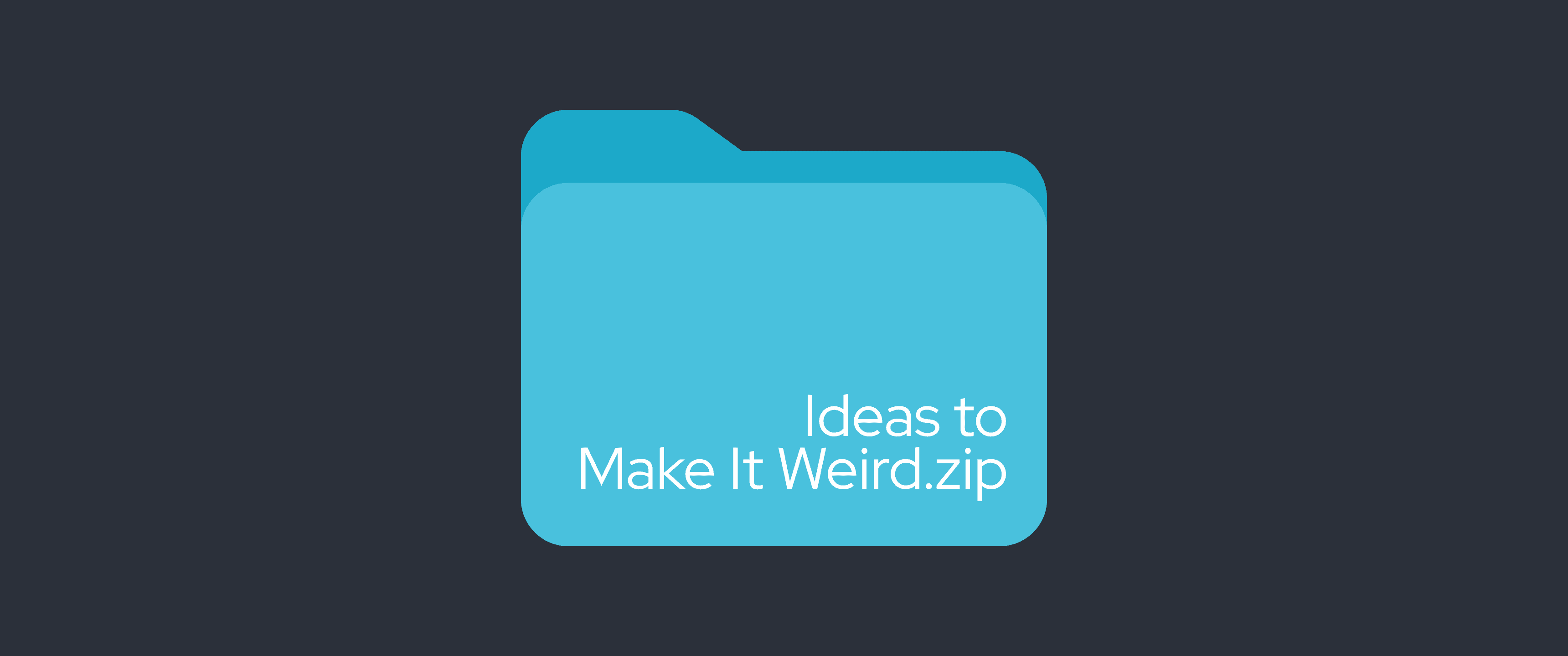
Blog header featuring a large blue folder icon labeled “Ideas to Make It Weird.zip” on a dark charcoal background. The minimalist design resembles a compressed file folder, symbolizing a collection of unconventional creative ideas and experimental inspiration.

INSIGHTS  •  8 min read

Make it weird: the case against safe branding in 2026

Safe branding feels low-risk. The data from Cracker Barrel, Jaguar, and Airbnb says otherwise. Forgettable is the one mistake you cannot recover from.

Jul 29, 2026
Blog header featuring the title “The Great Flattening” inside a rounded media player-style interface, flanked by a white play button on the left and a pause button on the right. The design uses a bold red gradient background with subtle layered outlines behind the title, creating a modern, minimalist aesthetic.

INSIGHTS  •  11 min read

The Great Flattening

Competence is the baseline. AI tools have pushed brand design toward the middle. Research and Cannes 2026 show the three things that still cut through.

Jul 29, 2026
Blog header featuring the words “Brave B2B” in large white typography over a white grid and bell curve chart on a warm orange-to-red gradient background. The clean, data-inspired design symbolizes bold, evidence-driven B2B marketing and strategic decision-making.

INSIGHTS  •  13 min read

Brave B2B: what a bearings company's space program teaches SaaS founders

SKF sells bearings and won the 2026 Cannes Creative B2B Grand Prix. Your SaaS brand probably will not. The problem is not talent. It is the brief.

Jul 24, 2026
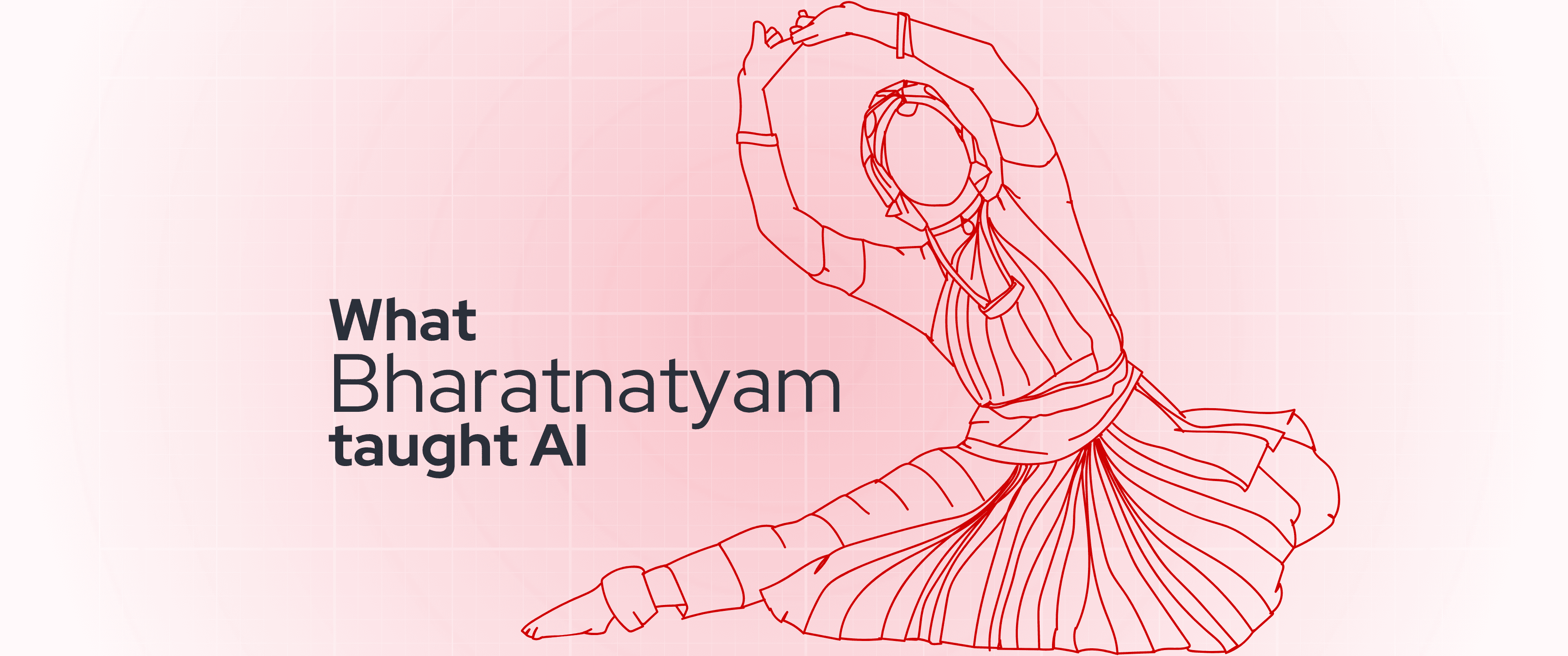
Blog header featuring the headline “What Bharatanatyam taught AI” alongside a minimalist red line illustration of a Bharatanatyam dancer in a classical pose. Set against a soft pink grid background, the design visually explores the intersection of traditional Indian dance, movement, and artificial intelligence.

INSIGHTS  •  8 min read

What robots learned from Bharatanatyam about technology itself

A 2025 study found mudras teach robots better than natural movement. This piece examines what that means for SaaS products that work but are not understood.

Jul 23, 2026
Blog header featuring a close-up of a vintage record player with a pink vinyl record spinning beneath a silver tonearm. Overlaid text reads, “Y2K Aesthetic is a decision you need to think through,” highlighting the resurgence of retro design trends with a nostalgic early-2000s visual style.

INSIGHTS  •  9 min read

Y2K aesthetics in SaaS branding: trend or trap?

Y2K aesthetics are a consumer trend built for buyers who decide in seconds. Most SaaS buyers decide over months, in groups. That mismatch is the trap.

Jun 25, 2026
Blog header graphic featuring the text “Apple’s new design language changes UX for you” across translucent, glass-like rounded panels. The design uses a bold red gradient background with abstract wave and circular line patterns, evoking Apple’s Liquid Glass-inspired visual aesthetic.

INSIGHTS  •  8 min read

Liquid Glass: One Year In. What It Actually Means for Your SaaS UI

Apple's Liquid Glass shipped across 6 platforms in June 2025. One year on: what actually changed, what filtered to the web, and what your SaaS team should do about it.

Jun 24, 2026
Blog header graphic featuring the text “Calm UI Mode” inside a translucent, glass-like interface card with a toggle switch. Set against a bold red gradient background with subtle abstract wave and circular line patterns, the design conveys a clean, minimalist interface inspired by modern calm UI principles.

INSIGHTS  •  10 min read

Why Calm UI Is Winning in 2026, and How to Design for It

Jun 24, 2026
Minimalist blog header featuring a white search bar with a magnifying glass icon and the query “dopamine designing?” centered on a soft orange gradient background. The clean, modern design evokes an online search interface focused on design and user psychology.

INSIGHTS  •  5 min read

Dopamine Design vs. Dopamine Loops: Same Word, Opposite Intent

"Dopamine" is the design world's favourite buzzword, and it describes two movements that want opposite things from you. One delights. One extracts. Here's how to tell them apart.

Jun 23, 2026

TheBullseye-branded cover graphic titled “2D Motion Systems: The Design Playbook.” The design features a soft pink-to-orange gradient background with abstract geometric elements, including concentric circles, striped circular patterns, and radial line bursts in red and white, creating a modern motion design aesthetic.

INSIGHTS  •  7 min read

What should SaaS Leaders really expect from a 2D design system?

Most SaaS design systems fix how a brand looks. The ones that drive adoption fix how a product is understood. Here are the six elements that make the difference.

May 29, 2026

TheBullseye branded graphic featuring the headline “Design for first chat, not second” in bold white text against a dark blue gradient background. Abstract blue and orange fluid shapes frame the composition, creating a modern, futuristic design aesthetic.

INSIGHTS  •  6 min read

Designing for the Second Conversation, Not the First

Most SaaS marketing wins the first click and loses the second. Here is why designing for buyer understanding, not just attention, is what shortens sales cycles and gets you chosen.

May 28, 2026

Abstract neon-themed graphic with glowing red and purple waves in the background, featuring a white outlined pill-shaped label in the center that reads “The SaaS Friction,” flanked by a right arrow icon on the left and an “X” icon on the right.

INSIGHTS  •  5 min read

Why Your SaaS Product Feels Harder to Use Than It Actually Is

Your SaaS product is not too complex. It is too hard to understand. Here is why clarity, not features, determines whether users activate, adopt, and stay.

May 26, 2026

Illustration of a stylized browser window with the headline “Best SaaS Brand Videos 2025–26” in bold text. The design features a red and blue layered frame, geometric shapes, grid background, and TheBullseye logo at the bottom.

INSIGHTS  •  12 min read

Best SaaS Brand Videos of 2025-26: What They Have in Common and What Most Get Wrong

What do the best SaaS brand videos of 2025-26 have in common, and where do most go wrong? TheBullseye breaks down the patterns behind the videos that build trust and drive adoption.

May 25, 2026

Subscribe to our newsletter

Get updates, case studies, and insights delivered to your inbox.

Insights | TheBullseye