Y2K aesthetics in SaaS branding: trend or trap?
Y2K aesthetics are a consumer trend built for buyers who decide in seconds. Most SaaS buyers decide over months, in groups. That mismatch is the trap.

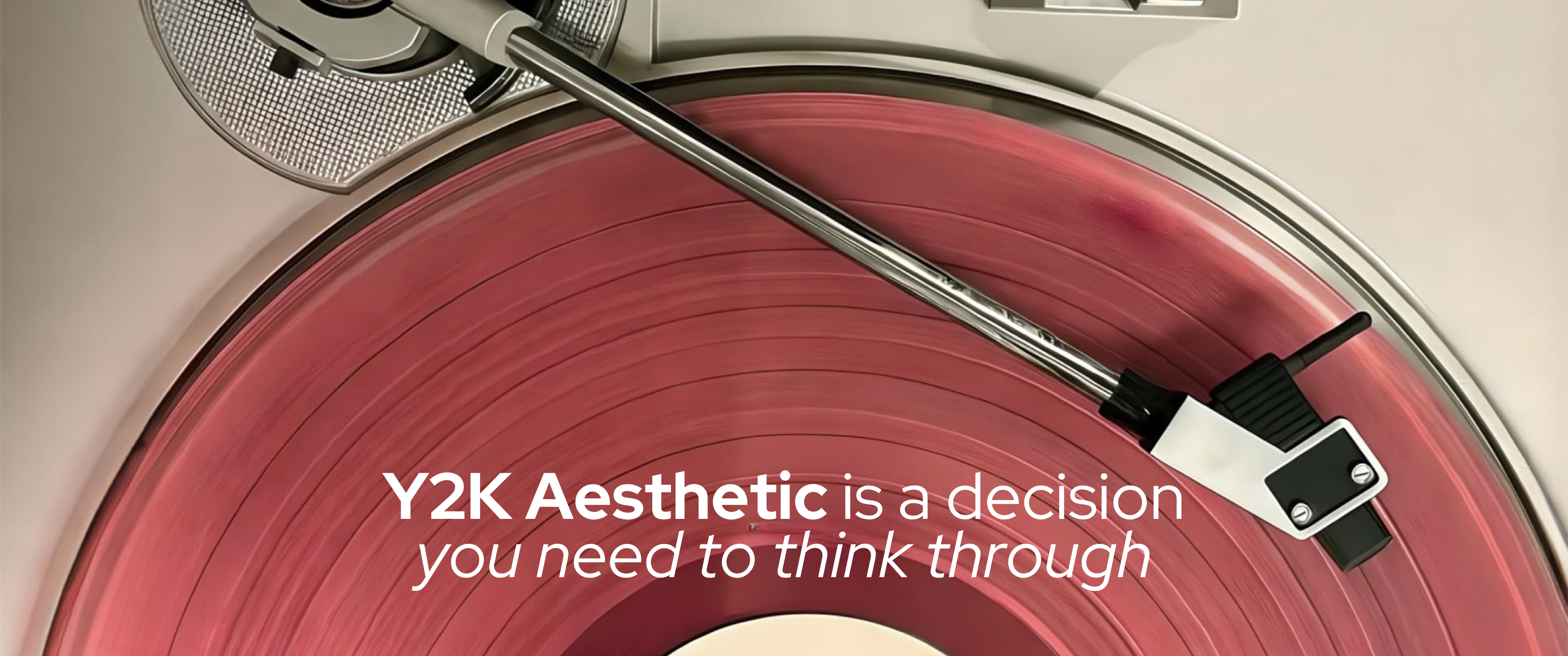
If you spend any time in design discourse in 2026, you have noticed: Y2K is back. Chrome finishes. Bubble typography. Neon gradients. Translucent interfaces that reference Windows XP and early iPod click wheels. Fashion brands have committed to it. Consumer products are saturated with it. Design trend reports from Figma, Envato, and Kittl all place it front and centre. The trend is real. It is also, for most SaaS brands, the wrong signal at the wrong time.
What Y2K actually is, and what it is not
The Y2K aesthetic covers roughly 1996 to 2003 — the design language of early broadband, firstgeneration digital cameras, and the techno-optimism that preceded the dot-com crash. Its visual vocabulary is specific: chrome and metallic textures, bold gradients in electric blue and hot pink, experimental typography that stretched and bent, glowing orbs and abstract digital forms. The overall signal was not refinement. It was excitement about what was arriving.
A distinction worth making: Y2K proper is routinely conflated with Frutiger Aero, a related but distinct aesthetic covering roughly 2004 to 2012. Frutiger Aero was Windows Vista, early iOS, the era of dewdrops on glass and nature imagery behind translucent interfaces. Named and documented by the Consumer Aesthetics Research Institute in 2018, it was Y2K with the chaos dialled back and the optimism kept: friendly, glossy, technically polished. Apple's Liquid Glass design language, introduced in 2025, draws more clearly from Frutiger Aero than from Y2K proper.
Both are in revival in 2026. They are siblings, not the same aesthetic. Knowing which one you are borrowing from matters — they send different signals, and they carry different risk profiles for SaaS branding.
Y2K aesthetic, defined
The visual design language of approximately 1996 to 2003, characterised by chrome and metallic finishes, neon gradients, bubble and stretched typography, and abstract digital forms. Named for the millennial moment its optimism was timed to. Often confused with Frutiger Aero (2004 to 2012), which was softer, glossier, and more nature-referenced — the successor aesthetic that Apple's Liquid Glass language draws from in 2025.
Why it works where it works
The brands using Y2K successfully in 2026 share a clear profile: they sell directly to consumers, they operate in categories where emotional response matters more than operational trust, and their buyers make decisions in minutes, not months.
Gen Z's relationship to Y2K is a documented phenomenon psychologists call anemoia — nostalgia for an era you did not live through. Research by Talker Research found that consumers spend, on average, 32% more on products they associate with nostalgia. Separately, 68% of Gen Z report feeling more positively about brands that use nostalgic aesthetics, even without personal memory of the original period. The emotional logic is not 'I remember this.' It is 'this feels like a version of the past I wish I had been part of.' That is a powerful consumer purchase signal.
Juicy Couture's revival. Samsung's Galaxy Z Flip campaign. Coca-Cola's periodic return to chrome-era packaging. Each is a purchase decision made on feeling — fast, personal, and aesthetic. The Y2K visual language was designed for exactly that context: to generate excitement and identity alignment in seconds. The problem for SaaS is that the context is completely different.
The SaaS problem: buyers use design as a trust proxy
B2B software buyers do not buy on nostalgia. They buy on confidence.
The 6sense 2025 B2B Buyer Experience Report found that the average B2B buying group involves more than ten stakeholders, the typical buying journey approaches a year, and buyers evaluate an average of 4.5 vendors before committing. In 85% of cases, the winning vendor was already on the buyer's Day One shortlist — meaning the first impression a brand makes often determines whether it enters evaluation at all, before a single demo is booked.
That first impression is doing significant interpretive work. Buyers cannot audit every vendor's security posture, engineering quality, or support model. They use visual design as a proxy for all of it. A polished, coherent, clear brand makes buyers infer: this team is disciplined. Their infrastructure is probably reliable. Their support is probably responsive. Their roadmap probably makes sense. None of that is provably true from a website. But buyers infer it, because they have to.
Enterprise buyers cannot audit every vendor's security posture or engineering quality. They use visual design as a proxy for operational maturity. The question is not whether your brand looks good. It is what your brand makes them infer.
What Y2K signals that most SaaS cannot afford
The problem is not that Y2K is unattractive, or that enterprise buyers dislike visual boldness. The problem is the specific set of inferences Y2K activates.
Trend participation
Y2K is visibly, self-consciously a trend. A brand that adopts it is signalling that it is responsive to design culture. For a consumer brand, this is reassuring: they are current, they are aware. For a B2B SaaS brand, it signals something else: we made a brand decision based on what was trending, not based on what our buyers needed to feel. Enterprise buyers are purchasing judgment and operational competence. Trend-following is the opposite of the signal they are looking for.
Consumer-grade orientation
Y2K is indelibly associated with personal consumer technology — gaming peripherals, fashion accessories, music players, early social platforms. A SaaS brand that borrows Y2K is borrowing a register that says: we are for everyone, not for professionals with complex workflows and accountability. For anything sold to procurement, finance, legal, or operations teams, this undermines the sale before the first meeting.
Playfulness over reliability
Y2K's visual vocabulary was built to communicate excitement about possibility: bubble fonts, chrome gradients, neon overlays all say: this is new, this is fun, this is not your parents' technology. In 2026, most SaaS buyers do not want fun. They want their operations to run reliably, in the background, without incident. Playfulness in the brand language directly contradicts the core product promise most B2B SaaS makes.
This connects to an argument made in our piece on calm UI design. Y2K is the loudest possible counter-position to what calm design advocates: where calm UI respects the attention budget, Y2K depletes it. Where calm UI signals confidence through restraint, Y2K signals excitement through maximalism. Both are deliberate choices. But only one aligns with what most B2B buyers need to feel before committing to a contract.
Where Y2K does work in tech
The exceptions are real and worth naming precisely, because the line between 'this works' and 'this undermines you' is the buyer profile, not the aesthetic quality.
Creative and design tools
Products competing in the Canva, Adobe Express, or Figma space are sold to creative professionals who respond to visual confidence. Y2K elements can read as design literacy, the brand knows the reference and is making it deliberately. The buyer is a designer. They understand the context and evaluate the choice as a conscious one.
Developer tools targeting individual decision-makers
A subset of developer tooling has successfully used retro-futurist aesthetics to signal cultural alignment with a younger engineering audience. Replit's approach — vivid, almost irreverent visual language — would be catastrophic for an enterprise HR platform and works precisely because its audience is making fast, individual decisions about personal tooling, not multistakeholder procurement decisions about operational infrastructure.
Consumer-adjacent SaaS
Products that sit between consumer app and SaaS tool — certain productivity tools aimed at individuals, community platforms, creative hobbyist software — can carry Y2K aesthetics because the purchase decision behaves more like a consumer decision: fast, personal, and aesthetic rather than group-evaluated and operationally focused.
The common thread: in each case, the buyer is making an individual decision quickly, on personal preference and identity alignment. Y2K works when the buyer behaves like a consumer. It breaks when the buyer behaves like an enterprise.
The question beneath the aesthetic
There is a more useful question than whether to use Y2K: what emotional truth is this trend trying to express, and is borrowing the aesthetic the best way to express it?
Y2K's emotional core is optimism about technology. The original aesthetic emerged from a genuine moment: the internet was transforming everything, computers were becoming truly accessible, the future felt like it was arriving on schedule. The design language said: this is exciting, and we are part of it. That optimism was earned by the moment. Applying the same visual code in 2026 is a reference, not an expression. References without substance read as borrowed.
SaaS brands that feel cold, corporate, and joyless are not communicating confidence, they are communicating indifference. The goal of feeling less like enterprise software is legitimate. The question is whether achieving it requires a consumer aesthetic trend, or whether it requires building a visual language that earns optimism freshly, from a specific point of view on the problem you solve.
The brands that feel most distinctly themselves in 2026 do not look like they found a trend and applied it. They look like they know exactly who they are. The confidence is present, but it is grounded in something specific, not borrowed from a cultural moment that is equally available to everyone.
TheBullseye perspective
What a SaaS brand communicates before a user ever sees the product sets expectations that the product must then confirm or disappoint. Y2K aesthetics set expectations that most SaaS products cannot and should not confirm: playful, consumer-grade and trend-aware rather than capable, reliable, and focused on the buyer's actual problem.
Most conversations about Y2K in tech stay at the surface level: does it look good? Is it on trend? Will it resonate with Gen Z buyers? These are the wrong questions for most SaaS brands. The right question is what the aesthetic signals to the person who is deciding whether to put you on their shortlist. That person is not evaluating your taste. They are deciding whether you are the kind of company that exercises good judgment. A brand that participates in consumer aesthetic trends is answering the judgment question in a way most B2B buyers find unconvincing. The emotional truth Y2K is reaching for: optimism about technology, excitement about what is possible, is worth pursuing. It is the 'how' that matters. The SaaS brands earning that feeling in 2026 are doing it through clarity, specificity, and a brand presence that reflects exactly what they believe about the problem they solve. Not through a trend. TheBullseye builds brand and video presence for SaaS companies. We start from the buyer's trust gap, not from a trend board.