Spatial Design Is Rewriting the SaaS Brand Rulebook. Most Teams Haven't Noticed Yet.
Most SaaS brands design flat. Apple's spatial shift has changed what premium UI looks like in 2026. Here is what it means for your brand and product.

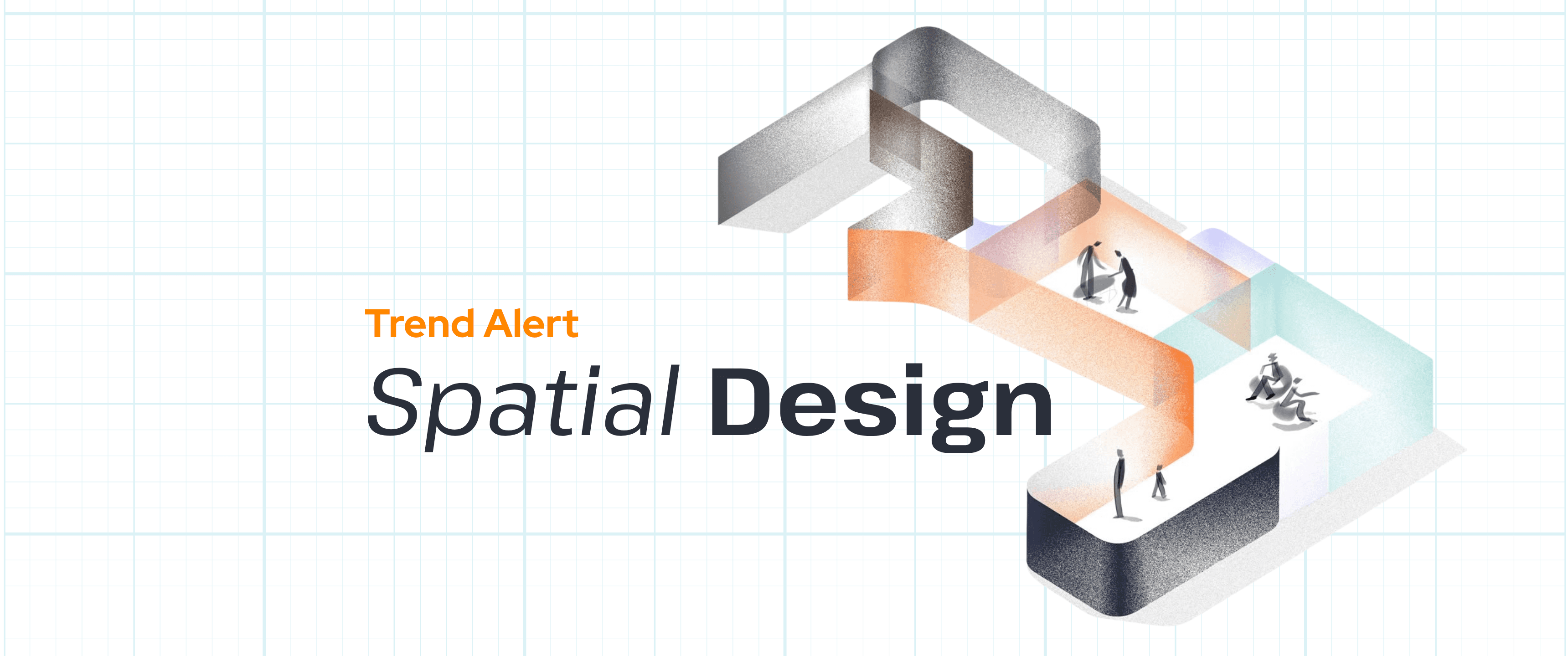
Why depth, translucency and layering have moved from Vision Pro to your flat screen, and what SaaS brands need to do about it.
Quick Answer
Spatial design (a visual approach that uses depth, translucency, layering, and lighting cues to create three-dimensional hierarchy on a flat screen) moved from Apple Vision Pro into mainstream SaaS UI design following Apple's Liquid Glass launch in 2026. For most SaaS teams it matters not because they are building a visionOS app but because depth is now a brand signal: products that use it purposefully read as premium, and products that ignore it are starting to look dated. The rule that makes spatial design work is simple: depth must serve hierarchy, not decoration. If removing your blur effects does not break your visual hierarchy, they were never working.
Something shifted in how SaaS products look in 2026, and most marketing teams cannot name it. The products that feel premium now have something their competitors do not: a sense of depth. Surfaces appear to float above backgrounds. Panels look translucent rather than solid. Shadows do not just sit at the bottom of a card. They place it in space.
This is not a coincidence, and it is not simply better design. It is the downstream effect of Apple's Liquid Glass design language arriving in iOS and macOS and pulling spatial computing principles into every flat screen that takes visual cues from Apple, which is most of them. The question for SaaS brand teams is not whether this shift happened. It already did. The question is whether your brand is responding to it.
Most are not. The majority of SaaS products and marketing sites are still built on flat design conventions that made sense in 2020: solid fills, minimal shadow, clean grids with no depth signal. That approach has not suddenly stopped working. But it has stopped looking current, and in a market where perceived quality shapes purchase intent before a demo is booked, that matters more than most brand teams acknowledge.
What Is Spatial Design, and Why Is It Now Relevant to SaaS?
Spatial design (a design philosophy rooted in principles of three-dimensional space: depth, translucency, layering, lighting, and the physical relationships between surfaces) originated in architecture and industrial design before entering digital UI through the introduction of spatial computing platforms like Apple Vision Pro and Meta Horizon OS.
In a true spatial computing environment, interface elements exist as physical volumetric objects floating in the user's real-world space. A panel is not a rectangle on a screen; it is a surface hovering two metres in front of the user, casting a soft shadow onto the wall behind it. The room's ambient light shines through its translucent edges. The user understands its depth not by reading a label but by perceiving it.
Glassmorphism (a visual effect that uses frosted-glass translucency to suggest a surface floating above a background layer) is the most visible expression of spatial design principles on flat screens. When Apple's Liquid Glass design language launched in 2026, it brought glassmorphism, depth cues, and adaptive translucency from visionOS into iOS 26 and macOS Tahoe, making these principles a baseline expectation across the Apple ecosystem. Products that did not apply similar depth began to look flat in both senses of the word.
What is Apple Liquid Glass?
Apple Liquid Glass is the visual design language introduced by Apple in 2026 that uses semi-transparent glass materials, adaptive specularity, and depth layering across iOS, macOS, and visionOS. It is intended to unify the visual language across Apple's device ecosystem and bring spatial computing aesthetics to flat screens. Liquid Glass was the most significant update to Apple's visual design system since the introduction of flat design in iOS 7.
Why Does Depth Matter, and Why Do Most SaaS Teams Get It Wrong?
The critical point about spatial design that most teams miss is the distinction between depth as decoration and depth as hierarchy. In a well-designed spatial UI, every layer communicates something. A frosted panel floating above a background is telling the user: this content is active; that content is context. A shadow is not aesthetic. It is a spatial relationship your brain processes faster than reading a label.
When teams apply spatial aesthetics without that logic, they get blur effects that do not communicate anything, translucency that makes text harder to read, and card shadows that contradict the page hierarchy rather than reinforcing it. Nielsen Norman Group flagged this problem directly when spatial design began spreading to flat screens: the trend risks prioritising visual spectacle over usability.
Apple's own experience confirms this. Liquid Glass launched in 2026 with aggressive translucency applied across the entire system. Within seven weeks, Apple had added a user-facing toggle to reduce or disable Liquid Glass effects after widespread feedback that the maximum glassmorphism treatment made some interfaces harder to use. If Apple cannot make maximum glassmorphism stick in a system it designed from the ground up, the lesson for SaaS teams is clear: use depth purposefully or not at all.
The glassmorphism lesson
Apple launched Liquid Glass with heavy translucency across iOS and macOS in 2026, then added a 'Reduce Transparency' option within seven weeks after user feedback about readability and cognitive load. The retreat from maximum glassmorphism is not a failure of the idea; it is a demonstration of the rule: depth must serve hierarchy, or it becomes noise. (Source: MacRumors, 2026, cited in StanVision UX/UI Trends 2026 analysis.)
What Does a Spatial Brand System Actually Look Like in SaaS?
The practical expression of spatial design in SaaS is a three-tier visual hierarchy applied consistently across the product and marketing site. The first tier is background data: information that is present but not currently active, rendered at lower contrast and without elevation. The second tier is the active workspace: the current context the user is working in, rendered at full contrast with mild elevation above the background. The third tier is contextual actions: panels, tooltips, and modal content that float visually above the workspace, using translucency and shadow to signal that they are temporary layers rather than permanent elements.
This three-tier hierarchy is the spatial logic that makes depth functional rather than decorative. When a notification slides in with a frosted glass background, the user understands intuitively that it is floating above the content rather than replacing it. When a command palette appears with a subtle lift and blur, the user knows they can dismiss it and return to exactly where they were. These are not animations. They are spatial relationships communicated visually.
The practical implementation does not require building a visionOS app. Cards that lift on hover, navigation panels with adaptive translucency, hero sections where the product screenshot sits on a visibly elevated surface above a gradient background -- these are all accessible applications of spatial logic to flat-screen design.
The spatial design test: if you can remove every blur, shadow, and translucency effect from your UI and your visual hierarchy still communicates the same relationships, the depth effects were decoration. If the hierarchy breaks, the depth was doing real work.
What Does the Spatial Shift Mean for Your SaaS Marketing Site?
The spatial design shift affects SaaS marketing sites in three specific ways. The first is product screenshot treatment. Screenshots of product dashboards are now expected to show a spatially aware UI: dark-mode-native where possible, with visible depth hierarchy in the dashboard layout. A flat, light-mode screenshot of a 2019-era dashboard sitting on a white background now reads as a signal that the product itself is behind the curve, regardless of what the product actually does.
The second is hero section layering. The best-performing SaaS hero sections in 2026 use spatial layering to make the product shot the unmistakable focal point of the page. The product image sits at the highest visual elevation, with background elements receding behind it and supporting text anchoring it in context. This is not a new design principle -- foreground-background hierarchy has always mattered -- but the spatial treatment makes it explicit in a way that flat design could not.
The third is motion and interaction. Spatial design implies movement that respects physical logic: elements should not appear from nowhere; they should enter from a direction that makes spatial sense, as if arriving from behind another surface or sliding in from an adjacent layer. This applies to page transitions, hover states, and scroll-triggered animations. The rule is the same as the rule for depth: motion should communicate a spatial relationship, not simply add visual interest.
How Should SaaS Brand Teams Respond to the Spatial Design Shift?
The spatial design shift does not require a full rebrand or a visionOS roadmap. For most SaaS brand teams, the right response is a visual identity audit with specific attention to the depth layer: is depth being used consistently, is it communicating hierarchy, and does it hold up at the smallest component level as well as the full-page level.
For teams building or rebuilding a visual identity, the depth decisions belong in the visual identity system alongside colour, typography, and grid. That means defining the shadow scale (how many elevation levels and what they represent), the translucency rules (which surfaces use it and when), and the motion principles (what direction elements enter from and how they exit). These are brand decisions, not engineering decisions. When they are left to individual engineers or left undefined entirely, the result is a product that looks spatially modern in some screens and flat in others, which is worse than a consistent flat design.
The trend to avoid
Glassmorphism applied for its own sake -- blur effects, translucent cards, and frosted panels deployed without a spatial hierarchy logic behind them -- is already the most overused and least effective design trend of 2026. Apple retreated from it. Nielsen Norman Group flagged it. The SaaS brands that apply depth without hierarchy are creating visual noise that makes their products harder to use while believing they are making them more modern. The question to ask of every blur effect: what spatial relationship is this communicating? If the answer is 'it looks good', remove it.
TheBullseye Perspective
At TheBullseye, we review brand and design systems for SaaS clients and we consistently see the same gap in 2026: teams that have heard about spatial design and responded by adding blur effects to their existing flat UI. The result looks like a flat design with an aesthetic layer on top, which is the opposite of what spatial design is.
Spatial design is not an aesthetic. It is a system for communicating hierarchy. When it works, users navigate faster and understand context more quickly because the visual relationships do the work that labels and instructions would otherwise have to do. When it fails, users experience higher cognitive load because the visual relationships contradict the interaction model.
The brands that will get spatial design right are the ones that treat depth decisions the same way they treat typography decisions: as brand architecture rather than visual decoration. That means defining the depth system in the visual identity layer of the brand playbook, not leaving it to whoever is styling the next component.
Sources
Kirilov, Stan. 'UX/UI Design Trends 2026: What's Working and What's Dead.' stan.vision/journal/ux-ui-trends-shaping-digital-products. StanVision, July 2026.
Nielsen Norman Group. 'Liquid Glass Usability.' Referenced in StanVision 2026 trend analysis. nngroup.com, 2026.
MacRumors. 'How to Turn Off Liquid Glass in iOS 26.' Referenced in StanVision 2026 trend analysis. macrumors.com, 2026.
UI Designer Editorial Team. 'Spatial UI and 3D Interface Design Guide 2026.' ui-designer.in/blog/spatial-ui-design-visionos-3d-2026, October 2026.
Apple Inc. visionOS Human Interface Guidelines -- Materials and Depth. developer.apple.com/design/human-interface-guidelines/materials, accessed 2026.
Figma. 'Introducing Figma Make.' figma.com/blog/introducing-figma-make, 2025. (40-60% faster feature shipping benchmark.)

Ready to tell your story on video?
Tell us about your product and goals, and we'll map out a repeatable video strategy for you.
FAQs
Spatial design in SaaS is the application of three-dimensional design principles (depth, layering, translucency, lighting, and motion) to flat-screen product and marketing interfaces. It is not about building augmented reality or virtual reality features. It is about using visual depth cues to communicate hierarchy: which elements are active, which are contextual, and which are background. Following Apple's Liquid Glass launch in 2026, spatial design principles have become a baseline expectation in modern SaaS UI.
Glassmorphism is a visual design effect that uses frosted-glass translucency to make a UI element appear to float above a background layer, with the layer beneath partially visible through it. It is one of the most common expressions of spatial design on flat screens. When applied with a clear hierarchy logic, glassmorphism helps users understand which content is active versus contextual. When applied decoratively, without a hierarchy reason, it increases cognitive load and makes interfaces harder to read.
Apple Liquid Glass is the visual design language Apple introduced in 2026, applying semi-transparent glass materials, depth layering, and adaptive specularity to iOS 26, macOS Tahoe, and visionOS. It was the most significant visual update to Apple's design system since the flat design shift in iOS 7. Liquid Glass is relevant to SaaS brands because products that take visual cues from Apple, which covers most consumer-facing software, are now being compared against interfaces that have spatial depth as a baseline.
Spatial design is a brand signal because users associate visual depth and layering with product quality, even when they cannot articulate why. In the same way that typography quality signals editorial care, and colour consistency signals brand investment, spatial depth signals that a product has been built to a modern standard. Products that remain fully flat in a category where competitors have moved to spatial depth begin to feel dated, which affects purchase intent before a trial or demo has taken place.
Three tests are useful. First, compare your product screenshots to the leading products in your category: if theirs have visible depth hierarchy and yours are flat, you have a visual gap. Second, remove all blur, shadow, and translucency effects from your current UI: if your hierarchy still communicates the same relationships, the depth effects you have are decorative and not functional. Third, check your brand guidelines: if they do not define a shadow scale, translucency rules, or motion principles, your visual identity system does not cover depth at all.
The three-tier spatial hierarchy is the most practical framework for applying depth to SaaS product design. The first tier is background data: information that is present but not active, rendered at low contrast without elevation. The second tier is the active workspace: the current context the user is working in, at full contrast with mild elevation above the background. The third tier is contextual layers: panels, tooltips, and modal content that float above the workspace using translucency and shadow to signal they are temporary. This hierarchy can be applied to any SaaS dashboard regardless of category.
No. Spatial design does not require a visionOS app or any augmented reality or virtual reality development. For most SaaS teams, applying spatial design means updating the flat-screen product and marketing site to use depth cues purposefully: elevation hierarchy, translucency where it communicates spatial relationships, motion that respects physical logic, and product screenshots that reflect a spatially aware UI. These are achievable with standard web and product design tools.
The main risk is applying depth decoratively rather than functionally. Blur effects, translucent cards, and layered shadows that do not correspond to any hierarchy logic increase cognitive load, make text harder to read, and create visual inconsistency that undermines trust. Apple's decision to offer a user toggle to disable Liquid Glass effects within seven weeks of launch is the clearest demonstration that maximum glassmorphism does not automatically produce a better interface. The rule is that every depth effect must communicate a spatial relationship: if it does not, it makes the design worse, not better.